Typography Class Book Design, The Wonderful Wizard of Oz
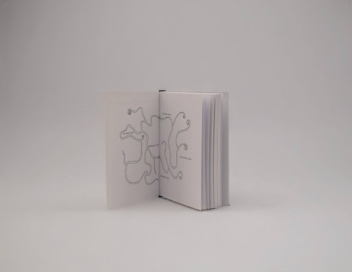
For this typography project, I reimagined The Wonderful Wizard of Oz as an edition for an older audience. Instead of leaning into a children’s aesthetic, I focused on restraint, structure, and materiality to make the book feel more archival and collectible. The cover is deliberately minimal and tactile, with the illustration engraved into the surface as a blind debossed line drawing so the image is revealed through depth, light, and shadow rather than color.
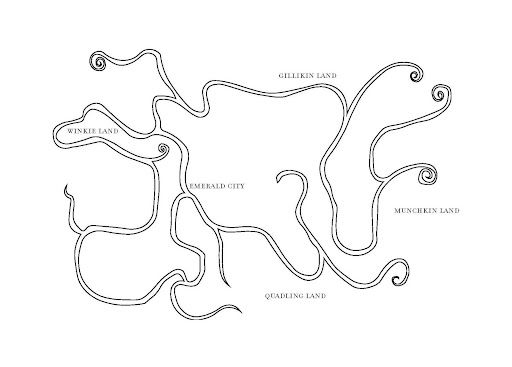
Inside, the book uses a consistent typographic system built on a grid, with controlled hierarchy and spacing to create a calm reading rhythm. A key narrative device is the initial inside spread, which becomes a full map of Oz. That map is not just decorative; it works as an information layer throughout the book. Between chapters, each chapter title is positioned on the map at the corresponding location in the story, creating a spatial table of contents that lets readers track the journey geographically as they progress.