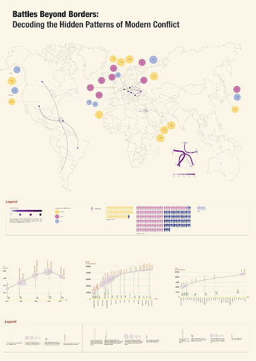
Battles Beyond Borders is a group data visualization project that translates personal geography into a comparative read of modern conflict. Each member selected their hometown as a starting point, then sourced and structured conflict-related metrics into shared Excel sheets, aligning units, time ranges, and categories so the datasets could be compared across locations. We then designed a single infographic that layers multiple encodings on one canvas: a world map as the spatial frame, curved flow lines to show cross-border movement and connections, and color plus scale to differentiate the contributors and the relative weight of each dataset. The supporting charts at the bottom turn the same speadsheet inputs into time-based trends and cumulative comparisons, so the poster moves from global overview to evidence and detail without losing coherence. This workflow follows core data-viz principles around task-driven design, clear visual encodings, and truthful, readable graphics.